ATHAR / Practical study
How can an Arabic RTL website feel premium and easy to use?
Premium RTL begins with reading order, type and spacing, not a late-stage CSS flip.
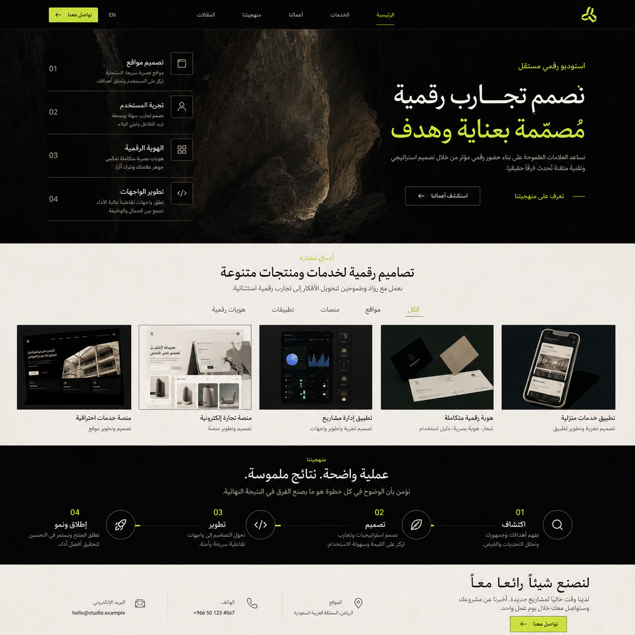 Preview template←
A strong Arabic experience begins with information order: what a visitor needs first, where the next action belongs, and how the interface preserves a right-to-left reading rhythm. We use legible Arabic type, considered spacing, and correct handling for icons and mixed-direction content such as phone numbers and email addresses.
Design the reading rhythm
An Arabic-first interface begins with the order of attention: the promise, the proof and the next step. Navigation, cards, arrows, figures and bilingual labels must all respect RTL rather than merely being mirrored.
Give luxury a useful role
Premium work is expressed through restraint: generous space, a deliberate type scale, material-quality imagery and fewer, clearer choices. The visual system should make complex information feel calm instead of making the visitor work harder.
Review mixed-direction moments
Test telephone numbers, dates, prices, maps, English brand names and form fields in real browser conditions. These small RTL details are where an otherwise polished project can lose credibility.
Practical principles
- Establish RTL hierarchy before visual styling.
- Use Arabic typography with a measured, readable line length.
- Treat icons and directional controls as functional language.
- QA every mixed Arabic and Latin-data component.